
I can usually spot an AI-generated website in about 0.5 seconds.
It’s not just the layout structure. It’s the vibe. It has that specific shade of “Tailwind Blue” or “Purple Gradient.” It has the same fonts, colors, and rounded corners. It has that clean, enthusiastic, yet totally robotic layout.
It looks… familiar. And that is the problem.
As AI website builders like Lovable, v0, and Base44 become the standard for quick launches, the internet is flooding with what developers are calling the “Sea of Sameness”.

For a marketer, this raises a critical question: Does looking “generic” hurt your brand?
If you are building a disposable landing page for a conference, probably not. But if you are building a core product page for a B2B SaaS, looking “average” can silently kill your conversion rates.
Here is why AI designs feel so generic—and how to decide when to accept it, and when to fix it.
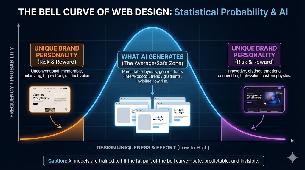
Why AI Design Feels “Calculated”
To understand why AI websites look the same, you have to understand how Large Language Models (LLMs) work.
AI models are prediction engines. They are trained on billions of existing websites. When you prompt an AI to “Build me a modern SaaS landing page,” it analyzes that training data and asks:
“Statistically, what is the most likely layout for a SaaS page?”
It then gives you the mathematical average of the internet.
- The Font: It chooses the most common, safe sans-serif (Inter or Roboto), avoiding anything with personality.
- The Layout: It defaults to the standard “Hero Left, Text Right” structure with three feature boxes below.
- The Color: It picks trendy “Purple/Indigo” gradients because that is what dominated tech design in the last 3 years.
- The Style: It applies rounded corners on everything and subtle shadows with exactly 0.1 opacity.
The Result: You get a design that is technically “clean” but emotionally “invisible.” It lacks visual hierarchy beyond “bigger text = header,” misses thoughtful white space usage, and is completely void of any unique personality or brand voice. As noted in recent analysis by Claude.ai, without specific, skilled direction, AI defaults to the lowest common denominator of design.
The Cost of “Average”: Why They Don’t Convert
Marketing is fundamentally about building “Know, Like, and Trust.” You need users to recognize your brand (Know), connect with your vibe (Like), and believe you are a credible authority (Trust).
The harsh reality is that a generic AI website fails all three of these tests simultaneously.
It fails the “Know” test because it doesn’t look like you—it looks like a template anyone could have bought for $10. It fails the “Like” test because it looks like everyone else, lacking the unique personality or emotional hook that connects with users. Finally, and most critically, it fails the “Trust” test. When a prospect lands on your site and sees the exact same layout they saw on five other sites this week, it signals “Low Effort.” In the high-ticket B2B world, low effort creates doubt.
If they didn’t invest in a unique website, did they invest in a unique product?
The AI Design Rule of Thumb
We know you are going to use AI. It’s the new standard because it is easy, fast, and accessible. You should use it.
But while the tools are amazing, they are still in development. The key to success isn’t using AI for everything—it’s understanding its limits so you don’t waste time trying to force it to do things it can’t.
Most posts suggest “better prompting” is the fix. We disagree. No amount of prompting will turn a Large Language Model into a Brand Designer.
Instead, use this rule of thumb:
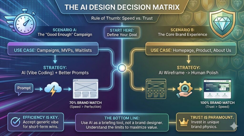
Scenario A: The “Good Enough” Campaign
Use AI (Vibe Coding) + Better Prompts
If you are launching a Conference Landing Page, a Specific Ad Campaign, or a Waitlist for a New Feature, speed is more important than perfect brand alignment.
- Goal: 70% Brand Match.
- Method: Upload your logo, primary colors (hex codes), and reference files to the AI tool. Guide it with clear instructions on the specific page type you need and exactly what sections should be included. It will look a bit generic, but for a 2-week campaign, that is an acceptable efficiency.
Scenario B: The Core Brand Experience
Use AI as Wireframe -> Human for Polish
If you are building your Homepage, Product Solutions Page, or About Us, you cannot afford to look generic. These pages must build 100% trust.
- Goal: 100% Brand Match.
- Method: Use AI to build the Wireframe (the structure). Let it code the columns, the grids, and the logic.
- The Fix: Do not try to “prompt” the final design. Hand that AI-generated code to a professional developer/designer to apply your actual Brand Physics—your custom fonts, your specific spacing, and your unique visual assets.
The Functional Gap
Beyond just the look, there is often a Functional Gap in these generic designs.
As we discussed in our previous article on publishing AI web pages, AI often skips the “invisible” work—like connecting your forms to your CRM or ensuring your SEO hierarchy is correct. A generic design often hides a generic (and disconnected) backend.
The Bottom Line
We use AI to improve productivity, but we often fall into the trap of spending hours “briefing” it on small changes, only to get average results.
Stop the “Prompt Loop”: If the AI gives you a bad structure or generic copy, don’t spend 3 hours trying to fix it with more prompts. Just stop. Switch to a conventional workflow. You are wasting time trying to teach a calculator how to paint.
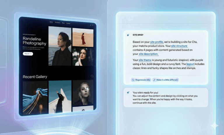
Use AI as the New “Brief”: Instead of writing a 3-page Google Doc to explain your idea to a designer or developer, spend 10 minutes in Lovable or v0, share a link. It is the ultimate briefing tool because it shows exactly what you mean.
Experiment, enjoy the speed, get inspired—but don’t expect AI to build your entire brand identity.
🚀 Need help turning your AI brief into a product?
We are the technical partner that brings concepts to life. Send us your ideas (or your AI wireframes), and we will build the secure, high-performance engine that powers them.
Frequently Asked Questions
AI models are prediction engines trained on the open web. Since Tailwind CSS and component libraries like Shadcn/ui are extremely popular in modern web development, the AI views this aesthetic as the “statistically most likely” answer to a design prompt. It defaults to the average of its training data—which currently happens to be indigo gradients and rounded corners.
Generally, no. While better prompts can improve structure, Large Language Models (LLMs) are not brand designers. They lack the “eye” for nuance, spacing, and emotional connection. As of late 2025, the consensus is that spending hours tweaking prompts yields diminishing returns. It is often faster to accept the AI wireframe and have a human developer apply the final styling.
Indirectly, yes. While Google doesn’t penalize AI code itself, “generic” designs often suffer from poor user engagement (high bounce rates) because they fail to build trust. Additionally, pure AI-generated code often misses “invisible” technical layers—like proper semantic hierarchy (H1-H6 tags) and Schema Markup. If no one manually reviews and fixes these technical gaps, your site may struggle to index correctly or capture “Rich Snippets” in search results.
It is best for short-term or speed-critical assets, such as conference landing pages, internal tools, or MVP (Minimum Viable Product) tests. In these scenarios, a “good enough” design is a smart trade-off for speed. However, we always recommend a “Pre-Flight Check” before you go live: manually review the site on your phone to ensure buttons work, forms submit correctly to your email, and no text is cut off. AI is fast, but it rarely checks its own work.